The Content
Page Layout
Masthead -
There is no masthead for this contents page, although in terms of magazines having common conventions upon each page, this university magazine doesn't follow it and really should have placed it anywhere upon the page, even if it isn't as obvious as other pages.
Layout -
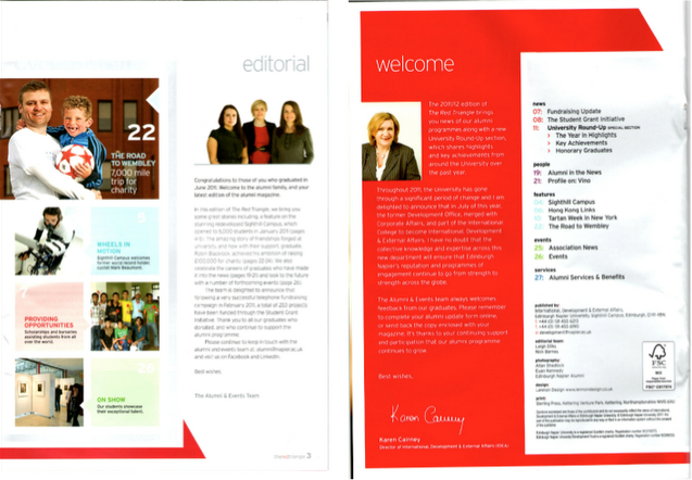
The layout for this magazine contents page the same theme as the front cover, a simple layout of the same colours (red,white and black) and outlines/borders/shapes. But in terms of the text there has been a mixture of even more colours such as blue, purple and green. This does not follow magazine conventions because the theme isn't quite the same and may put the target audience off by how unprofessional it looks.
Colours chosen for this layout is red, white and black, this will be suitable for the target audience because it will fall under the Stanley Hall theory as these colours could be connoting emotion as the layout of this page looks very pale and dull just like the front cover.
Imagery -
Also to balance out that there is older target audience for this magazine aiming at a mass audience, there are is an image of a father holding his son in his arms. This would have also been deliberately done by the editors of this magazine to let the older audience know that the education for this university is for everyone, not just for youth's who have just finished College/6th form. Once again this image will fall under the Blumer and Katz theory.
In terms of denotation image of people with different coloured skin, this could connote that this university is a acceptance type university and will welcome anyone in terms of their beliefs and culture. Therefore this will disagree with the theorist Malik because these people stereotypically in this image look very approachable and are being accepted into University even if they are different than being British.
Text -
There is a comment from the headteacher of the University, which is using a members resources technique by trying to gain a relationship with the audience who are interested at attending this school. This has been placed in there deliberately to try and encourage the reader/mass audience even more in what such a good university this will be when they attend it for further education.
But in terms of denotation, the text is very simple and quite dull which makes the university look as if they have either rushed this magazine or really don't know who their target audience are because their trying to make it suitable for such a mass of people of such a variety of ages. Therefore this could put some of their audience off, but you could argue its easy to read because its all spaced out.
This piece of analysis is more focussed on the denotation, it would have been improved with more discussion of connotation also. But you are demonstrating your research and the building of your knowledge of the genre and the conventions of contents pages.
ReplyDelete