My Evaluation Link
Evaluation Part 3
Friday, 4 May 2012

Tuesday, 1 May 2012


Sunday, 22 April 2012
What I Learnt In Photoshop
When creating my media products making them suitable for the target audience that I had analysed and discovered through my audience research, I had to learn very quickly about photoshop because I had never used it before.
But what I did learn through photoshop was how to edit images and add images, this was done through finding a suitable font for my headings through UrbanFonts.com and print screening the image from there to edit in photoshop, changing the colours and editing the size to make it suitable to place within my Contents/Front Cover/Main Feature Spread pages.
When placing in images, text and etc, I learnt that Photoshop had provided layers to make the image look more natural and realistic, so it took me a while to adapt to this before I could understand fully what to do in terms of adding effects such as smoke and overlays.
Next I learnt how to erase facial features upon the magazine with the "Spot healing brush tool." This was very useful because it helped my star vehicle/model look like perfection in terms of presentation just like the many other rock genre magazines I had analysed.
In terms of affects I learnt when I was adding smoke upon my main feature, that you could affect the opaque settings and the appearance, this helped me quite a lot because it went with the theme of my star vehicle calling her album "Smoke Screen."
But what I did learn through photoshop was how to edit images and add images, this was done through finding a suitable font for my headings through UrbanFonts.com and print screening the image from there to edit in photoshop, changing the colours and editing the size to make it suitable to place within my Contents/Front Cover/Main Feature Spread pages.
When placing in images, text and etc, I learnt that Photoshop had provided layers to make the image look more natural and realistic, so it took me a while to adapt to this before I could understand fully what to do in terms of adding effects such as smoke and overlays.
Next I learnt how to erase facial features upon the magazine with the "Spot healing brush tool." This was very useful because it helped my star vehicle/model look like perfection in terms of presentation just like the many other rock genre magazines I had analysed.
In terms of affects I learnt when I was adding smoke upon my main feature, that you could affect the opaque settings and the appearance, this helped me quite a lot because it went with the theme of my star vehicle calling her album "Smoke Screen."
Friday, 30 March 2012
Un-Used Photo's

This image was not used because the majority of my target audience would not have preferred this image for the front cover or even in any of the magazine, mainly because my model looks very nervous trying to get comfortable with the photoshoot, therefore it wouldn't fall under any theorists that would be suitable for this music genre.


These images within my magazine because the majority of them were just rough photo's I took because I hadn't used a photography camera and it took me a short period of time to adapt to the settings and controls. Also as their early images, my model had to find her comfort zone before getting comfortable with the posing for the magazine. But these images are a variety of medium shots and close ups of my model posing in her batman fan clothing.
Overall some of this images does not suit the Stanley Hall or Laura Mulvey theory.
These images would not be suitable for the Laura Mulvey (1975) because my model is not in the images portrayed as a lady with perfect hair or got the camera aimed at certain area's of her figure to attract a male audience.
In terms of the Stanley Hall theory (1904), my model would not had fallen in this stereotype because like I mentioned earlier, some of these images were just my model finding her comfort zone before she could pose confidently, so some images are not depressed, sex or criminal like.
But if I were to apply an theorist to my model it would be the Medhurst (1998); "their awful because their not like us" because my model ain't afraid to stand out with her trend or personality traits.


Creating Of My Double Page Spread


After trying to add smoke into my image, it didn't quite work out to how I had planned because of the wall background and graffiti in my main image. So instead I played with the opacity settings within photoshop and got this as an end result, this will suit the satisfaction for my target audience who are rebellious because the graffiti in my main image stands out even more and therefore will suit my target theorists who are applied within my target audience Stanley Hall.
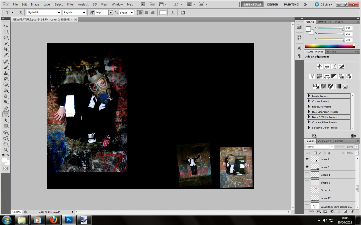


After finding a suitable font to use as my headline within UrbanFonts.Com. I then copied and pasted the font into photoshop and recoloured the font before cutting it out and placing it onto my black background. The reason I had chosen red for my second main colour was because it will suit the Stanley Hall theory in terms of how colour will connote moods within youths, meaning it will be suitable for my target audience.
The reason why I have placed my main title in the middle of the page is because after seeing the page I analysed from Kerrang! I noticed that their main title was also spread across the double page spread, not being to affected when it is printed.


This is when I added the text onto the image as well as the Loud Rock magazine logo. The reason why I bolded the questions being asked was to make them stand out and separate from the answer that my star vehicle Jessica Benn had given. Being suitable for the target audience who fall under the Blumer and Katz theory. The main story will relate to the star vehicle promoting her new album and the text within the white box was a album review upon the rock star vehicle called "Slash" from the rock band "Guns N Roses." Now all that will be left to do will be to add a quote from the interview, which will most likely be in the colour green to represent bitching and jealousy, following the Stanley Hall's theory.

This is the finishing product!
Un-Used Fonts
 .
. 
But I did create them because they were inspirations at the time for the rock magazine before I gained more information about my target audience.
Subscribe to:
Posts (Atom)