

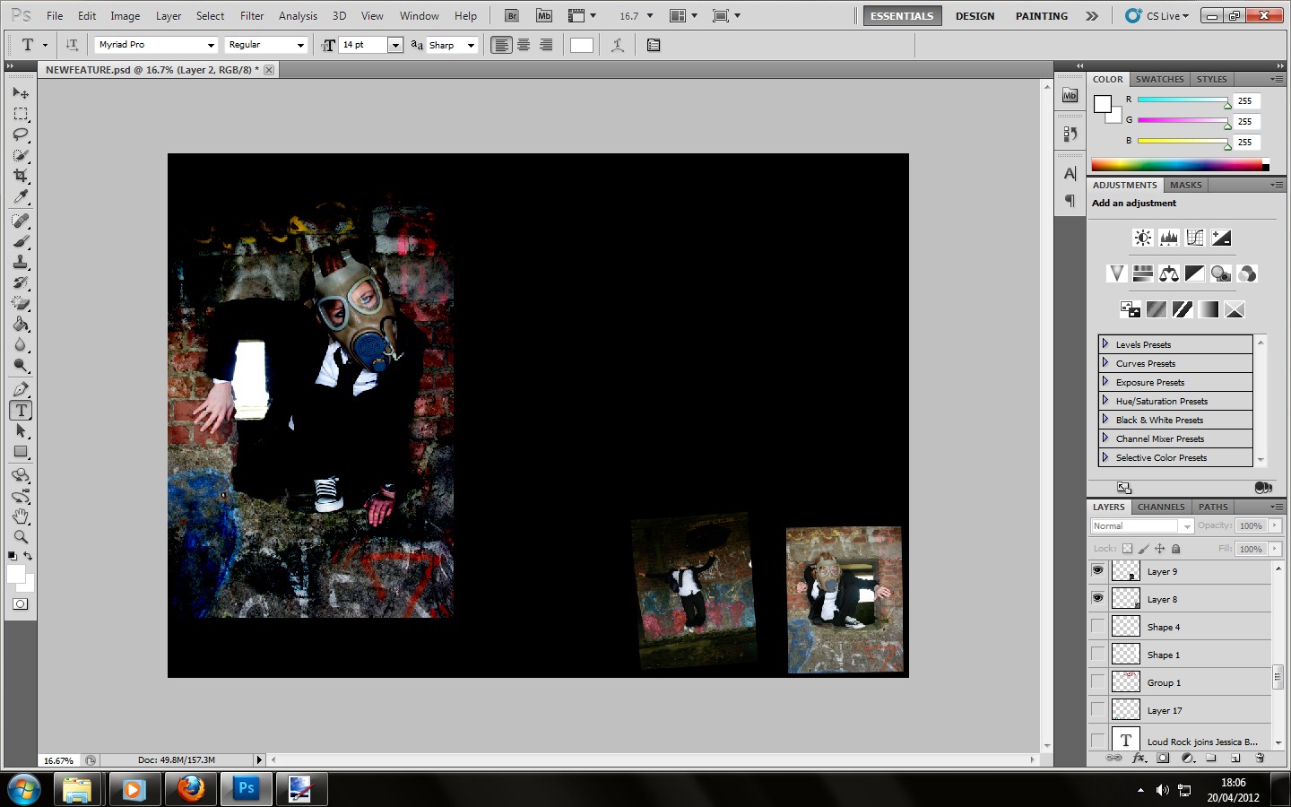
After trying to add smoke into my image, it didn't quite work out to how I had planned because of the wall background and graffiti in my main image. So instead I played with the opacity settings within photoshop and got this as an end result, this will suit the satisfaction for my target audience who are rebellious because the graffiti in my main image stands out even more and therefore will suit my target theorists who are applied within my target audience Stanley Hall.


After finding a suitable font to use as my headline within UrbanFonts.Com. I then copied and pasted the font into photoshop and recoloured the font before cutting it out and placing it onto my black background. The reason I had chosen red for my second main colour was because it will suit the Stanley Hall theory in terms of how colour will connote moods within youths, meaning it will be suitable for my target audience.
The reason why I have placed my main title in the middle of the page is because after seeing the page I analysed from Kerrang! I noticed that their main title was also spread across the double page spread, not being to affected when it is printed.


This is when I added the text onto the image as well as the Loud Rock magazine logo. The reason why I bolded the questions being asked was to make them stand out and separate from the answer that my star vehicle Jessica Benn had given. Being suitable for the target audience who fall under the Blumer and Katz theory. The main story will relate to the star vehicle promoting her new album and the text within the white box was a album review upon the rock star vehicle called "Slash" from the rock band "Guns N Roses." Now all that will be left to do will be to add a quote from the interview, which will most likely be in the colour green to represent bitching and jealousy, following the Stanley Hall's theory.

This is the finishing product!
No comments:
Post a Comment