

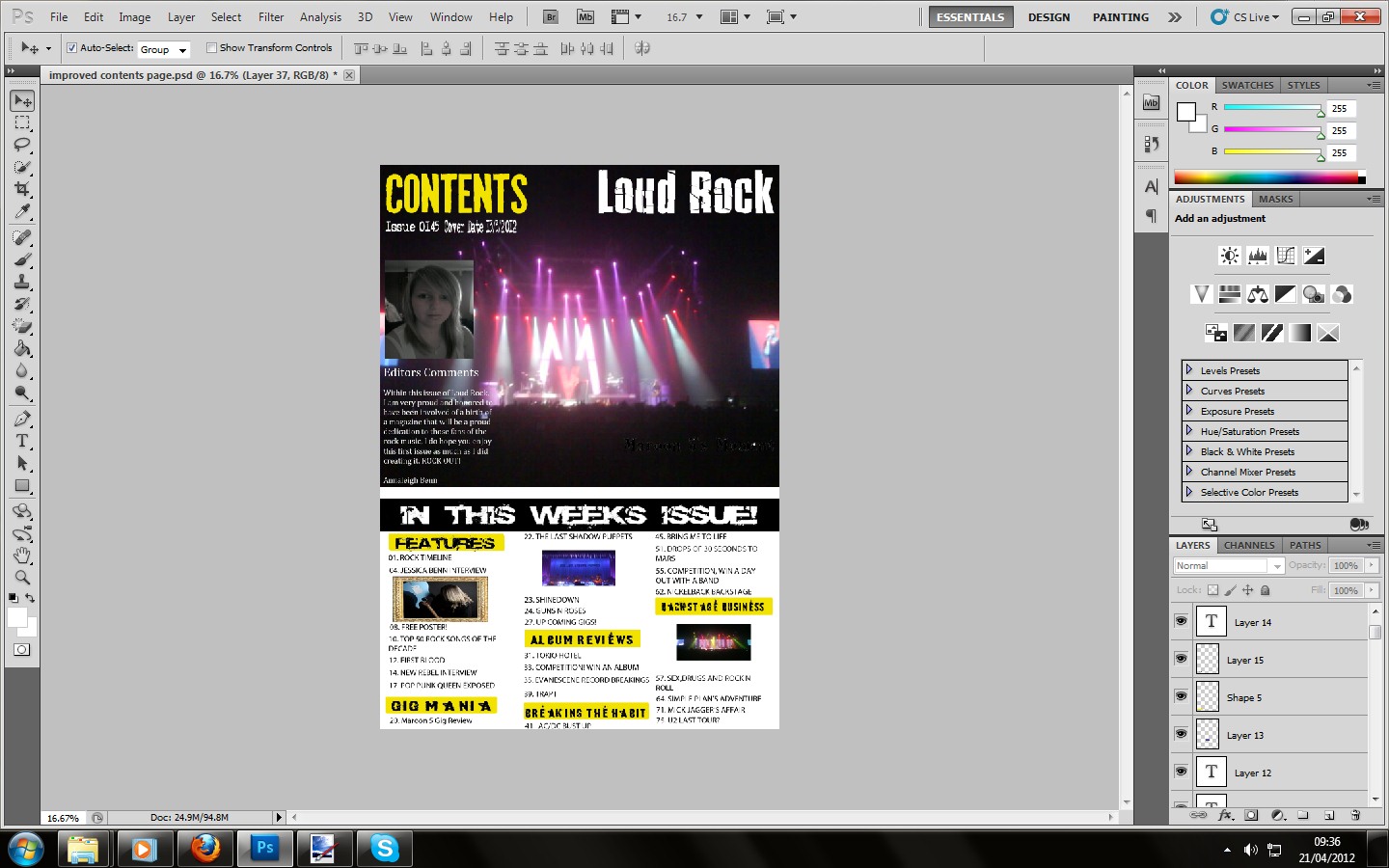
But in the final piece of creating the product will have a short piece of text in a white box to congratulate Maroon 5 on their international chart topper "Moves Like Jagger" because its related to a legendary rock star.


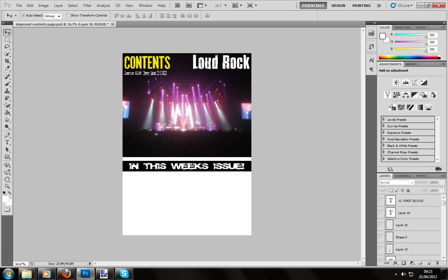
Then more common conventions for a magazine were added, in terms of the issue number of the magazine and date it was released, making it a suitable collectors item for the target audience who I predicted will be faithful and passionate buyers for the rock music genre, meaning they will continue to buy these issues.
The black box was then added across the half way point of the page before adding the "In this weeks issue!" to make the target audience who fall under the Blumer and Katz theorist know what page to find the information for their purpose of purchasing the magazine.
In terms of font choice, I chose something that looked rebellious and "broken" suiting emotion, meaning it will be suitable for the target audience who fall under the Stanley Hall theory.

The text for this feature was then added and the patches of bigger and more creative font was placed upon yellow background boxes because this would make the reader more clear of the sections in case they are reading the magazine for a particular purpose; Blumer and Katz. Whilst underneath the categories are other stories about rock star, star vehicles with their page numbers.
But the text on the Maroon 5 image is the editors comment, my own personal speech about how proud I would be about creating the magazine and distributing it to the world for those passionate about the rock music genre just like I am. This was also used in my star model of Kerrang! So I also did it to make it look more realistic.
But the images in the main area will be framed just like the frame around Jessica Benn, just to keep the theme running through just like it did on the contents page.

The finishing product.
No comments:
Post a Comment